Downsampling time series data
Learn how Phare use downsampling to show uptime monitoring data while providing the right balance between user experience, and performance.

At Phare uptime we allow you to view your monitor's performance data with up to 90 days of history. While this might not seem like a lot, a monitor running every minute will span about 130 thousand data points during that time frame, for a single region.
Showing that amount of data in a graph would be slow and impossible to understand due to the sheer number of data points. Finding the best solution requires the right balance between user experience, data quality, and performance. We need to tell you the story of your monitor's performance in a way that is easy to understand, fast, and accurate.
In this article, we dive into a few techniques that we used to downsample the data by 99.4% while keeping the most important information.
Raw data
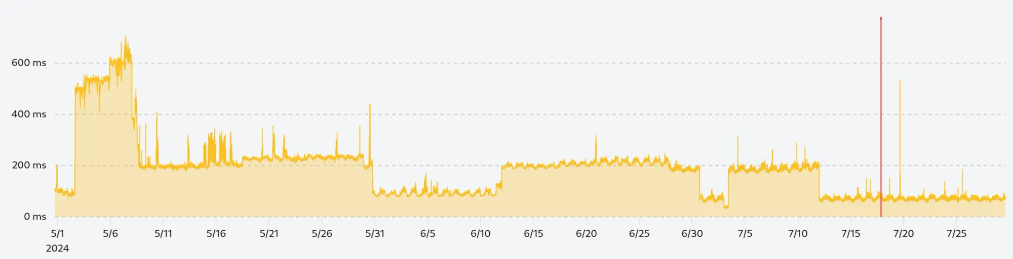
We start with the raw data collected from monitoring the Phare.io dashboard in the last 90 days. The performance varied a lot during this time frame thanks to a noisy CPU neighbor, which made it the perfect candidate for this article.
If we plot the raw data with 130 thousand points, we get a chart that looks like this:
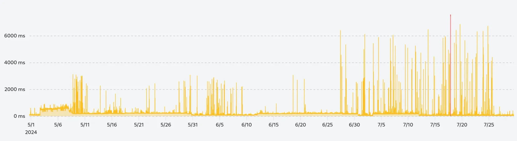
The performance is not terrible, loading the data takes about 230ms, and rendering the chart is done under 100ms, which is already better than a lot of other charts out there. But the real problem is that the chart is unreadable, we can't see any patterns, and it's hard to understand what's going on.
The confusion does not only come from the number of data points but also from the scale difference in the data. The vast majority of the requests will be performed under 200ms, but about 0.1% of them will be slower. It does not matter how fast your website and our monitoring infrastructure are, there will always be a few requests that will be slower due to network latency, congestion, or other factors.
Removing anomalies
Our first step is to remove the anomalies from our data set. A single 4-second request among a few thousand will skew the data and make it hard to read. We need to remove these anomalies in a way that will keep any sustained decline in performance visible.
To solve this problem, we can use one of two techniques:
- Standard deviation: We can calculate the standard deviation of the dataset and remove any data points that are outside a certain multiple of the standard deviation.
- Percentile: We can calculate the 99th percentile of the data set and remove any data points that are above that value.
Both solutions offer similar results, but need to be applied on a rolling window to make sure that we don't remove any sustained decline in performance and keep anomalies in periods of high performance.
We use the formula rolling mean + (3 x rolling standard deviation) to remove any data points that are three standard deviations above the rolling mean, and chose a rolling window of 30 (15 points before and after the current point):
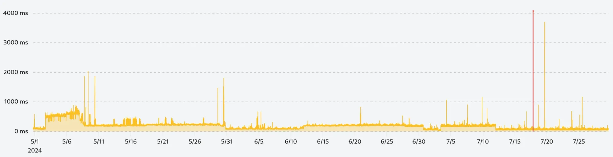
By zooming in on the few remaining spikes, we can see that they are not isolated anomalies but sustained periods of lower performance which we want to keep in our data set.
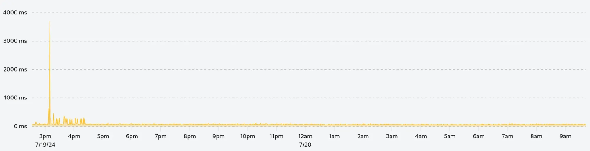
The following is a zoomed-in view of the tallest spike on the right, we can see that the spike is followed by a series of slower requests over 1h30, this is exactly the kind of information we want to keep:
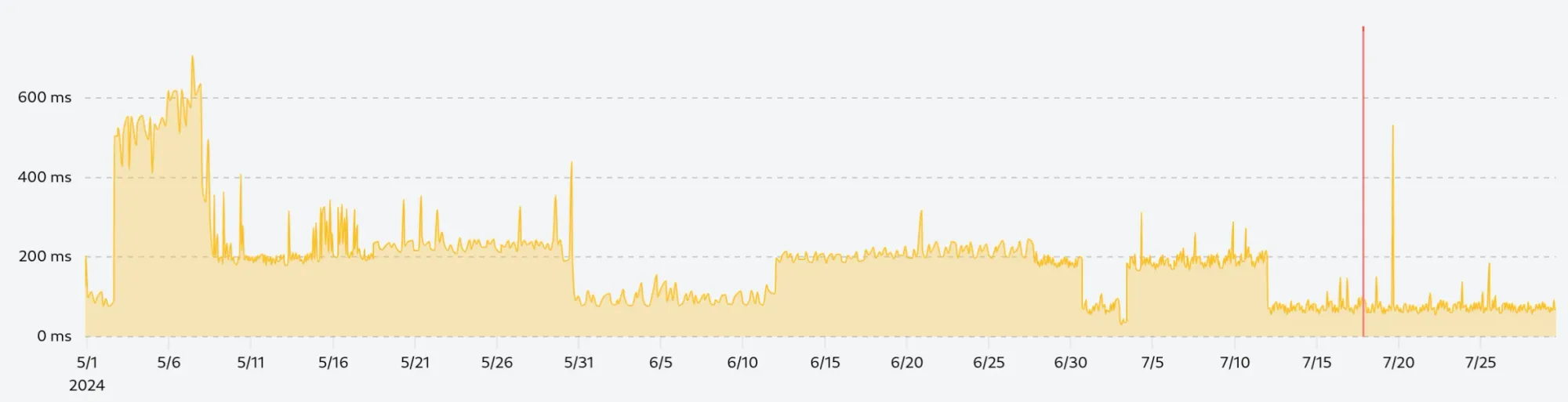
If we did not calculate the deviation or quantile in a rolling window, we would get the following chart, which removes everything above 600ms while keeping many anomalies in the lower performance range:
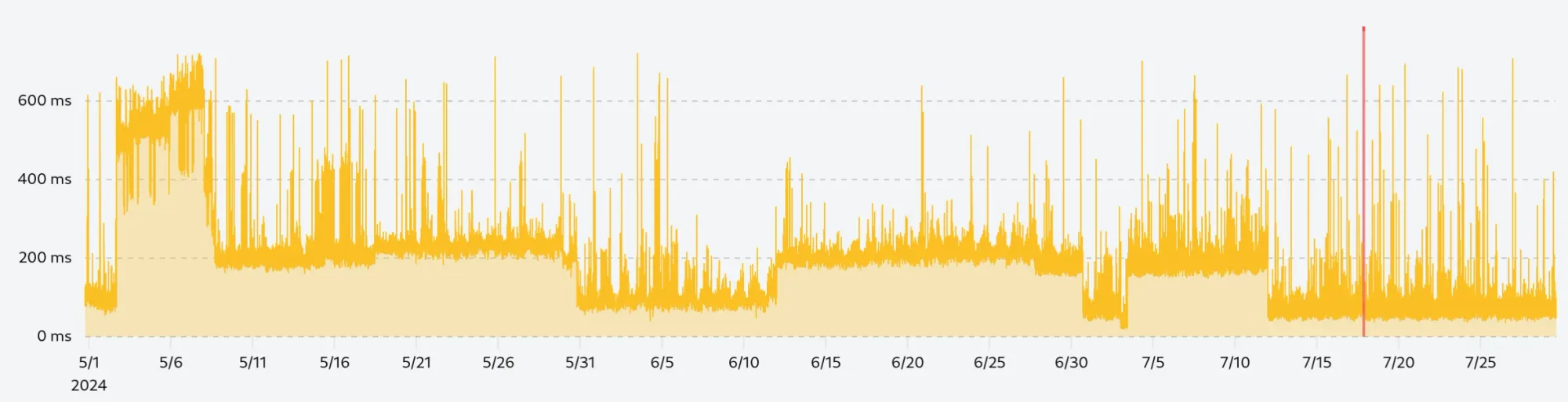
Rolling window average
The next step is to smooth the data with a rolling window average. This technique will slightly reduce the gap between two adjacent data points and make the chart more readable while allowing us to detect trends in the data.
For this example, we use a rolling window of 10 data points (5 points before and after the current point) to smooth the curve without losing too much information:
Downsampling
Our data is now clean and smooth, but we still have 130 thousand data points to display which cost bandwidth and rendering performance. To reduce the number of data points without losing too much information, we can use the largest triangle three buckets (LTTB) algorithm.
The LTTB algorithm is a downsampling technique that finds the most important points in the data set by dividing the data into buckets and selecting the point with the largest triangle area in each bucket. In simpler words, the algorithm will only keep the points that are the most representative of the data set so that the overall shape of the curve is preserved.
By applying the LTTB algorithm to our data set, we can reduce the number of data points from 130 thousand to 750, which is a reduction of almost 99.5%. In the form of a JSON payload, we go from 1.53 MB to 13 KB, which is a significant reduction in bandwidth.
As you can see, the chart looks almost identical to the full data set, but uses only a fraction of the data points.
It is important to carefully prepare the data before applying the LTTB algorithm, as the algorithm is specifically designed to preserve the overall shape of the curve it will keep any anomalies into the final data set.
Implementation with ClickHouse
ClickHouse is a powerful column-oriented database optimized for analytical queries that offers unparalleled performance for time series data. We extensively use it at Phare to store and analyze the performance data of your monitors.
All the techniques described in this article can be implemented in a single ClickHouse query using the largestTriangleThreeBuckets function, as well as window functions.
-- Apply the LTTB algorithm to the data set
SELECT
  largestTriangleThreeBuckets(750)(
    `cleaned_results`.`timestamp`,
    `cleaned_results`.`time`
  )
FROM
  (
    -- Smooth the remaining data with a rolling window average
    SELECT
      `raw_results`.`timestamp`,
      avg(`raw_results`.`time`) OVER (
          ROWS BETWEEN 5 PRECEDING AND 5 FOLLOWING
      ) AS `time`
    FROM
      (
        -- Select the raw data
        SELECT
          `timestamp`,
          `time`,
          -- Calculate the rolling window average and standard deviation
          avg(`time`) OVER (
              ORDER BY `timestamp` ROWS BETWEEN 15 PRECEDING AND 15 FOLLOWING
          ) + 3 * stddevSamp(`time`) OVER (
            ORDER BY `timestamp` ROWS BETWEEN 15 PRECEDING AND 15 FOLLOWING
          ) AS anomalies
        FROM
          `performance_table`
      ) AS `raw_results`
    -- Filter out anomalies
    WHERE
      `raw_results`.`time` < `raw_results`.`anomalies`
) AS `cleaned_results`
Drawing the data
Phare uses uPlot to draw charts in the frontend. uPlot is a small, fast, and flexible charting library, which perfectly fits our needs. It allows us to draw charts with a large number of data points with the best possible performance, where other libraries would struggle.
Keep in mind that uPlot is a low-level library, which means that you will need to spend a good amount of time configuring it to get the desired result. But the performance and flexibility it offers are worth the effort.
Because we already processed the data with ClickHouse, we only need to separate the data in two arrays, one for the x-axis and one for the y-axis, and pass them to uPlot.
new uPlot(options, [
  timestamps, // x-axis values
  times // y-axis values
], document.body);
Of course, Phare implementation is more complex than that, we need to handle responsive, live-streaming, and displaying uptime incidents, but this goes beyond the scope of this article.
Conclusion
By removing anomalies, smoothing the data with a rolling window average, and downsampling the data with the LTTB algorithm, we were able to reduce the amount of data by 99.4% while keeping the most important information.
The chart is now readable, fast to load, and easy to understand.
Would you like to see this performance chart for your own website? Sign up for free and start monitoring your website today.